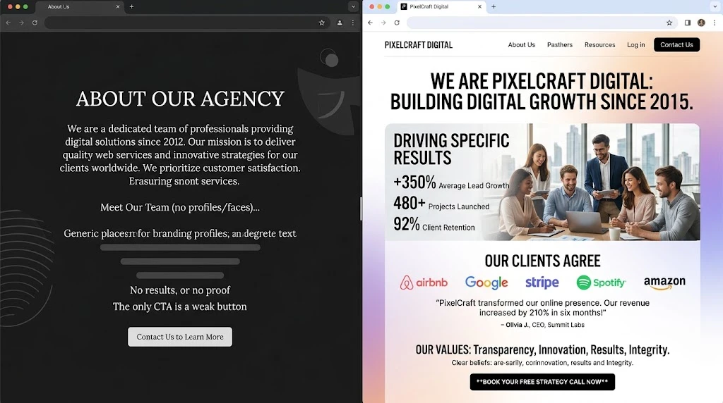
Scroll through twenty random “About Us” pages and a pattern emerges fast. Nearly all of them begin with the company’s own story, burble through a list of vague aspirations, and close with a generic mission statement. The visitor finishes reading with no clearer sense of whether this business can actually help them.
That’s a structural failure, not a writing failure. And it’s fixable.
When a prospective client clicks into your About page, they arrive with a specific mental agenda. They’ve already evaluated your homepage and service offerings at a surface level. What they haven’t yet decided is whether you’re credible, whether you understand their particular situation, and whether you’re someone they’d be comfortable handing money to. These are deeply personal questions, and they deserve a page built specifically to answer them.
This moment matters enormously for a freelance website designer and equally for any established web design company. Analytics consistently place the About page among the top traffic destinations on professional service websites. Below is a proven structure, broken into its component parts, with reasoning behind every choice.
Resist the Urge to Talk About Yourself First
There’s a gravitational pull toward opening with your credentials. “Founded in 2015, our award-winning agency…” feels safe and authoritative. But it犯了 a fundamental error: it assumes the reader is already invested enough to care about your history. They’re not.
Consider the visitor’s emotional state instead. They’re skeptical, busy, and scanning for reasons to stay or leave. Your opening must speak to that reality. Rather than announcing your founding date, try naming the specific frustration your clients share. Something like: “Your website was supposed to be a growth engine. Instead, it feels like a digital business card nobody asked for.” That reframing positions you as someone who grasps the problem before you’ve spent a single word on yourself.
Keep this introduction lean — two to three sentences max. Acknowledge the visitor’s pain point. Signal that a path forward exists. Save the biographical material for later, once the reader has reason to want it.
Answer the Three Questions Driving Every Visit
Beneath the surface, every visitor evaluates your page against three criteria. Whether they articulate it mentally or not, they’re asking:
- Can this person actually deliver what they promise?
- Have they done this successfully for businesses similar to mine?
- Would I feel comfortable working alongside them?
Your page layout should mirror this sequence precisely. Each question gets its own territory.
Prove Ability Through Detail, Not Adjectives
Superlatives without substance are invisible to discerning readers. “We’re passionate about crafting innovative solutions” is a sentence that blends into the background noise of every competitor’s page. It has no weight because it has no specificity.
Concrete proof works differently. A website designer with a track record in the nonprofit sector might write: “In the last five years, I’ve completed 70-plus website projects for nonprofits ranging from local food banks to international advocacy groups.” That detail is immediately believable, easily verifiable, and far more impressive than any string of adjectives. For professionals still building their portfolio, niche specificity is equally powerful. “I exclusively build Evolt education sites for independent course creators” communicates authority without padding.
Prove Relevance to Their Situation
There’s a profound difference between a service provider who claims broad expertise and one who demonstrably understands the nuances of your particular field. Visitors sense that distinction immediately and respond to it emotionally.
Reference the industries you serve by name. Briefly describe the type of engagements you handle. When a web design company that specializes in creating digital presences for independent dental practices makes that focus explicit, the office manager visiting the page immediately relaxes. The internal response is instinctive: these people know my world.
A single relevant metric strengthens the connection considerably. “Dental practices we’ve redesigned for have averaged a 55% increase in appointment requests within the first quarter post-launch.” State it once, state it cleanly, and move on. Your portfolio page can handle the deeper narrative.
Put a Face to the Name
This recommendation appears in virtually every article about About pages, yet its consistent neglect across the internet proves that awareness and execution remain far apart. Browse through competitor pages and notice the absence of genuine human representation.
If you’re an independent website designer, this is non-negotiable: include your real photograph. Choose one that communicates warmth and approachability rather than corporate stiffness. A potential client should study the image and conclude that a working relationship with you would feel natural, not transactional.
For studios and agencies, introduce the full roster. Names. Photographs. Brief personal notes that go beyond job titles. “Aisha, our project manager, spent seven years coordinating events for the hospitality industry before joining us in 2019.” That biographical fragment performs a remarkable function. It transforms an abstract company into a constellation of real individuals with real trajectories. And real individuals command a level of trust that institutional branding simply cannot generate.
Position Your Origin Story in the Middle — Not the Beginning
Your founding narrative earns its place on this page, but positioning is everything. Stories at the top compete with the visitor’s core questions. Stories in the middle reward a reader who’s already decided you’re worth learning more about.
Distill your history into a tight arc. What triggered the decision to start? What conviction crystallized through that experience? How does that conviction show up in your daily operations? Those three beats — catalyst, belief, practice — form a complete narrative without a single wasted sentence.
Here’s an effective rendering: “I built my first website for a friend’s catering business in 2012. It took twice as long as it should have because nobody had taught me to think about the visitor’s experience first. That early mistake became our defining principle — every project begins with audience research, never with aesthetics.” The story has a clear lesson embedded within it. The reader walks away understanding not just your history, but your methodology.
If any biographical detail doesn’t serve the reader’s evolving understanding of who you are today, remove it without sentimentality.
Articulate Your Standards — The Ones You Won’t Compromise
A brief values section accomplishes two strategic goals simultaneously. It reinforces your credibility and it performs early-stage client filtering.
Picture a website designer who publicly states that every project includes basic search engine optimization regardless of scope or budget. Making that standard visible tells potential clients that you operate from principles rather than convenience. It resonates with quality-focused buyers and naturally discourages those shopping purely on price — a filtering effect that benefits both parties.
Prioritize depth over breadth. Two or three specific, memorable convictions outweigh a sprawling list of generic virtues. “We believe in creativity and teamwork” is a sentence no one recalls. “We’ll tell you honestly when an idea won’t serve your business goals, even if agreeing would be easier” is a statement that stays with people.
Give Them Exactly One Clear Next Step
An About page that concludes without a directional prompt wastes every bit of attention it has earned. The visitor has just spent real time engaging with your content. Their receptivity is higher than at any other point during their visit. Guide them to what comes next.
Offer a single, unambiguous call to action. “Browse our featured projects” or “Set up a no-obligation consultation” are both reliable choices. The right option depends on how your pipeline typically works. Whatever you select, make it visually dominant and impossible to overlook.
For a web design company, linking directly to selected case studies or portfolio highlights is often the most effective bridge between storytelling and conversion. After absorbing your philosophy and narrative, the reader’s natural impulse is to see the work itself. Satisfy that impulse at the exact moment it surfaces.
Small Details That Compound Into Trust
Write conversationally. First person feels like a real human talking. Corporate third person feels like a press release. The tonal difference shapes how every other element on the page is received.
Use the ear test. Read your full draft aloud at a steady pace. Sentences that sound unnatural in speech will read unnaturally too. Smooth every rough spot before publishing.
Refresh on a schedule. An About page referencing outdated facts — wrong team size, discontinued services, stale numbers — actively erodes the credibility it was built to establish. Set a recurring reminder to audit and update it at least twice per year.
Apply the swap test relentlessly. Go through each sentence and ask a blunt question: could a direct competitor copy this line into their own About page without anyone noticing? If yes, it’s not pulling its weight. Replace it with language that could only come from your experience and perspective.
The Single Principle That Changes Everything
Stop treating your About page as a self-introduction. Treat it as the answer to one specific question: what does a visitor need to know before they’re willing to trust you?
Demonstrate capability through concrete evidence rather than aspirational language. Reveal the actual people behind the professional facade. Then make the path to the next step effortless and obvious. These three actions separate About pages that quietly generate business from those that sit untouched.
Take a few minutes right now to revisit your About page with a fresh perspective. Read it as though you’re encountering your business for the very first time. The gaps between what you’ve written and what a new visitor genuinely needs to discover will reveal themselves quickly — and every gap you close strengthens your ability to earn the trust that drives real growth.
Comments
No comments yet. Be the first to react!