Your homepage is your digital handshake. Visitors arrive, scan the layout, absorb the headline, and decide within seconds whether to stay. That opening moment is critical. But it is only the beginning. What happens when they accept your invitation and step inside? Do they find a guided tour or a confusing labyrinth?
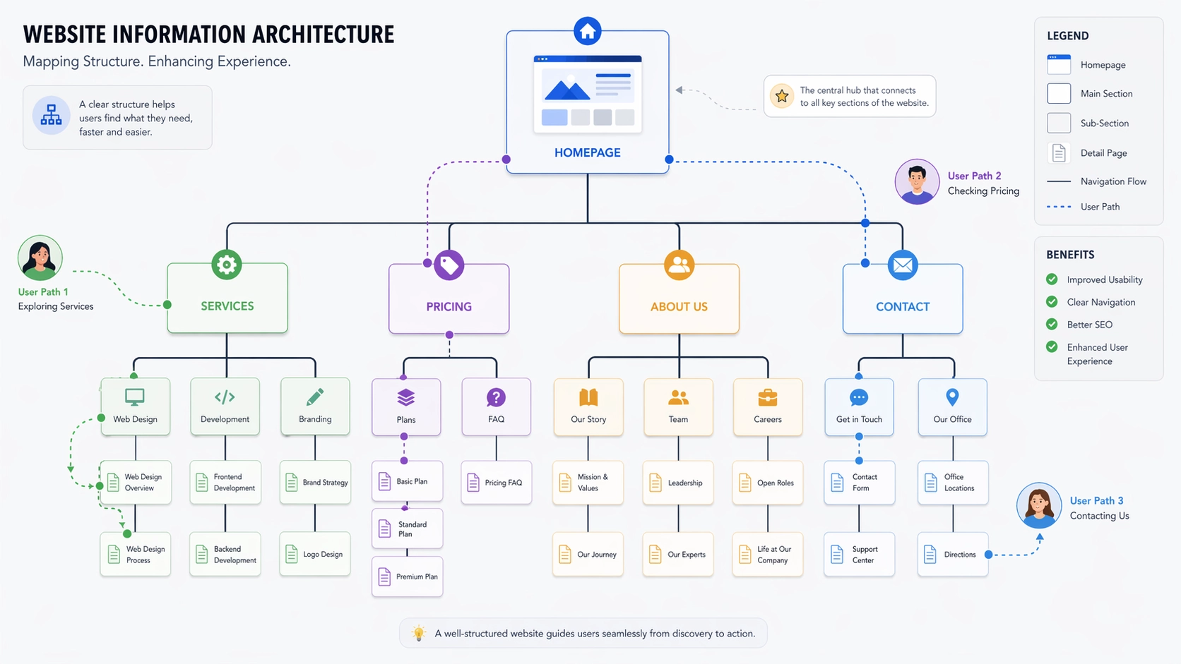
That underlying framework is information architecture. It is the science of arranging content so that people can find what they need without conscious effort. A chaotic structure alienates users. It undermines their confidence in your brand. No stunning visual design on the front page can compensate for a broken experience beneath.
In my years as a web designer, I have watched project after project stumble at the finish line because teams obsessed over surface details. They hired discount web design services to keep budgets lean, assuming that logical organization would emerge naturally. That assumption dies the moment a visitor clicks past the hero banner. Robust information architecture supports every square inch of your site, not just the threshold where guests arrive.
Here is why the hidden structure of your content deserves your urgent attention, even if a full redesign is not on your calendar.
What Is Information Architecture?
Information architecture is the invisible scaffolding of your website. It defines which pages connect to which, how topics group together, and how users move through your digital space. Think of a well-designed airport with clear signage directing travelers to gates, baggage claim, and ground transport. Now imagine an airport with no signs, no maps, and no logical layout. The difference between those two experiences is the difference between good and bad IA.
Effective IA creates intuitive pathways. A visitor should know without hesitation which button reveals your pricing, which link explains your process, and how to reach a human being. Ineffective IA forces them to guess, click randomly, and eventually surrender.
This discipline extends far beyond the main navigation bar. It includes your folder hierarchy, the network of internal links, the precision of your search tool, and the wording of every label. Anything that helps someone understand where they are and what they can do next is part of information architecture.
Why It Shows Up After the Homepage
The homepage is not the destination. It is the invitation. People come to your site with questions, and they expect answers. If your structure blocks their path, they will not waste time figuring it out. They will simply leave. Too many organizations believe the homepage carries the entire burden of conversion. It does not. It is the opening act, not the headliner.
Consider a scene that plays out countless times daily. A prospect reads your homepage headline and thinks you might have what they need. They click Services, expecting clarity and detail. Instead, they land on a thin page with a handful of loosely related subcategories. None of them clearly address their specific situation. They bounce back to search results and try the next option.
Your analytics tell this story in cold numbers: low pages per session, high exit rates, short average durations. These are not design flaws. They are structural failures. And they are rarely fixed by making things prettier or adding more features.
A skilled web designer who understands IA begins with user flows, not font choices. They map out how real people think and search before putting a single pixel on screen. That preparation eliminates the gap between visitor intent and site performance.
Common Problems to Watch For
Unclear Navigation Labels
Menus are often polluted with vague corporate language. Words like Solutions, Platforms, or Ecosystems replace straightforward descriptions. A first-time visitor has no idea what these terms mean in your context. Choose labels that communicate instantly.
Too Many Options
A navigation bar crammed with ten or more top-level items overwhelms the human brain. Decision fatigue sets in immediately. Limit your primary menu to five or seven carefully chosen items. Everything else belongs in secondary navigation.
Broken Links
Websites are living documents. Pages move, content gets retired, URLs change. If you are not actively maintaining your internal links, they rot. Encountering a dead link feels like knocking on a door that leads nowhere. It signals abandonment. Regular audits are essential.
Content Silos
In many organizations, departments operate as independent fiefdoms. Marketing owns one section. Product owns another. Support lives in its own world. The result is a fragmented experience where related information is scattered across disconnected corners. Collaboration is the only cure.
Missing Hierarchy
When every heading looks the same, nothing commands attention. Readers cannot distinguish primary topics from supporting details. A clear visual hierarchy of headings, spacing, and typography guides the eye and makes content scannable.
How IA Affects Search Engines
Google discovers your content by crawling links, just as users do. A logical, well-connected structure helps search engines understand the relationships between your pages and the relative importance of each one. That comprehension feeds directly into how you rank.
Pages buried deep in your site structure—requiring multiple clicks from the homepage—may never be crawled at all. Valuable content goes undiscovered. New posts sit in limbo. Proper IA ensures that important pages are accessible and receive adequate link authority.
A clean sitemap also accelerates indexing. When you publish updates or launch new offerings, Google finds and processes them faster. In competitive markets, that speed can be the difference between capturing attention and missing the moment.
SEO and IA are now inseparable. A web designer who understands both builds sites that perform for algorithms and humans alike.
Improving Your Current Site
You do not need to start from scratch. Targeted improvements often deliver the best return on investment.
Begin by observing real users. Give them specific tasks and watch where they struggle. Note every pause, every misclick, every moment of confusion. Their friction points are your roadmap to better structure.
Group related content together. Eliminate redundant pages that compete for the same audience. Flatten your hierarchy where possible. Every layer of depth is a barrier. Reducing barriers keeps users engaged.
Add breadcrumbs to your interior pages. These simple navigational aids show users exactly where they are in your site hierarchy and give them an easy way to backtrack. They also reinforce your structure for search engine crawlers.
Refine your menus through testing. Try different arrangements. Make sure your most important actions and destinations are immediately visible. Less critical information can live in footers or expandable sections.
When to Hire Help
There comes a point when self-organization is no longer practical. If your site spans hundreds of pages, bringing in a professional web designer makes sense. They bring methodologies and templates that scale. They build systems that maintain structural integrity as you grow.
E-commerce businesses face acute pressure in this area. A catalog with thousands of products needs a category structure that makes discovery effortless. Shoppers who cannot find what they want quickly will not become buyers. Revenue depends directly on architectural clarity.
Quality web design agency include strategic discovery as a core part of their process. They invest time understanding your business, your audience, and your goals before producing a single design. That foundation prevents the expensive rework that follows hasty execution.
Do not wait for your traffic to decline before addressing information architecture. Be proactive. Small adjustments now prevent major headaches later.
Practical Tips for Building Better IA
-
Know Your Users: Structure your site around how your audience thinks and searches. Their mental model should drive your decisions, not your internal org chart.
-
Map Before You Build: Create diagrams showing how pages connect. Test the flow with wireframes before committing to visual design.
-
Keep It Consistent: Use the same labels and placements across your entire site. Predictability reduces cognitive load and builds trust.
-
Test Early: Run usability tests during development, not after launch. Fixing navigation problems in a prototype is far cheaper than fixing them in production.
-
Plan for Growth: Design your architecture to accommodate future expansion. Build in capacity for new content without requiring constant reorganization.
-
Audit Regularly: Review your analytics monthly. Look for dead ends, high-exit pages, and confusing user paths. Address patterns before they become entrenched problems.
Final Thoughts
Your homepage opens the door. Information architecture determines whether visitors stay inside. It shepherds them from curiosity to action, page by page. Without it, even the most attractive site becomes an exercise in frustration.
Respectful organization acknowledges that your users came with purpose, not patience for puzzles. Whether you work with a web designer or manage your own site, give structure the same priority you give style.
Clarity is the ultimate conversion tool. When visitors can navigate your site with confidence, they become customers who trust your brand. Make their journey straightforward. Make it obvious. Make it work.
Comments
No comments yet. Be the first to react!