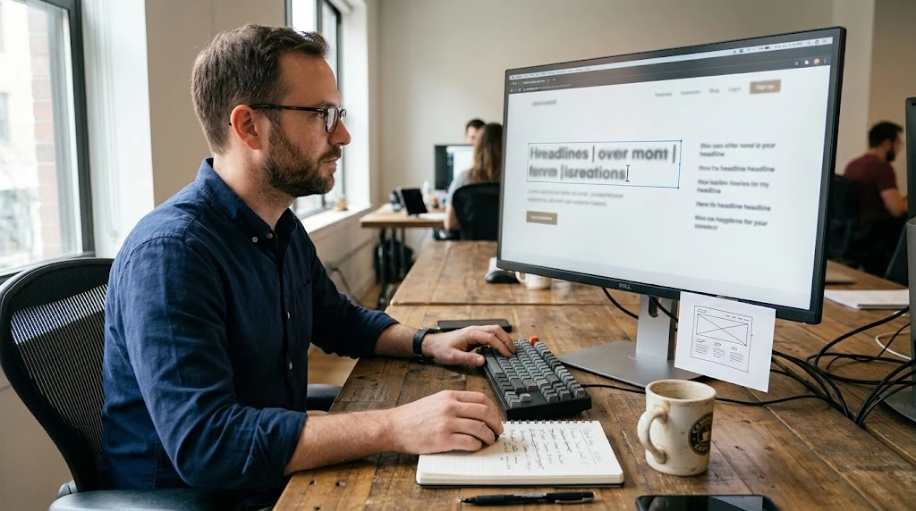
A visitor clicks a link, lands on your homepage, and gives your headline exactly one chance. Not ten seconds. Not five. Closer to three. In that brief window, their brain decides whether this page deserves more attention or whether to move on.
It’s a ruthless filter. And the vast majority of headlines on the internet fail it.
Not because the people behind them lack skill. Because they default to the same tired patterns — vague promises, hollow adjectives, and language that sounds polished but communicates nothing. “Empowering Tomorrow’s Leaders” tells a visitor nothing about what they’ll find if they keep scrolling. It’s decoration, not direction.
The real question isn’t whether headlines matter — everyone knows they do. The question is what makes one actually work. After years of studying how people interact with real pages, I’ve found the answer lies in a handful of repeatable principles.
Plain Language Beats Polished Phrasing
The temptation to sound sophisticated runs deep. Writers reach for words like “synergy,” “leverage,” and “paradigm” because they assume complexity signals competence. It doesn’t. It signals that the author was more interested in sounding impressive than being understood.
A headline’s sole job is to make someone want the next line. That requires clarity, not ornamentation.
Consider “Cut your invoicing time from two hours to fifteen minutes.” Nothing fancy about it. But it works because a reader immediately understands the benefit. They can picture themselves in the scenario. Now they want to know the method.
If you’re collaborating with a website designer on a new project, raise this point early in the process. Visual thinkers naturally gravitate toward dramatic type and striking composition. Those instincts add real value. But the headline carries the intellectual weight. When words lead, the design supports them more effectively than the reverse.
Specificity Builds Trust Instantly
There’s a reason most corporate headlines feel interchangeable. They lean on abstract nouns and broad claims that could describe virtually anyone. “Helping businesses succeed” communicates nothing specific. It could apply to a consulting firm, a software startup, or a landscaping crew.
Now look at this: “We helped 14 local restaurants fill their Tuesday night seats by 40%.” Suddenly there’s something concrete. A reader can picture the scenario. They can decide whether it’s impressive. And they’re curious about the method.
That curiosity drives the scroll. Vague claims create no friction. Specific ones stop the eye because they provoke a reaction — agreement, skepticism, or intrigue. All three keep someone reading.
You won’t always have a statistic ready. That’s fine. Specificity also comes from naming a precise audience — “freelance illustrators” instead of “creative professionals” — or describing a tangible outcome — “a three-step onboarding checklist” instead of “comprehensive solutions.” A website designer who internalizes this concept naturally gravitates toward headlines that feel grounded rather than generic. This preference for precision over abstraction is one of the clearest markers of effective web communication.
Write for One Person, Not a Crowd
Some headlines read like they were composed for an anonymous audience of thousands. “Streamline Your Reporting Process.” “Optimize Your Workflow.” “Leverage Data-Driven Insights.” These sentences address no one in particular. They hover in the abstract, aimed at a demographic instead of an individual.
Effective headlines do the opposite. They target one reader and speak to that person directly.
“Still spending your Sunday evenings formatting reports?” creates a completely different dynamic. It sounds like someone who knows your situation. It names a frustration most people have experienced. And because it feels personal, it earns the kind of attention the corporate version never could.
Making this shift is simpler than it sounds. Use “you.” Pose a question. Name a specific pain. If you run a website design company, you already appreciate the value of empathy in user experience. Headlines deserve that same human-centered treatment.
Hold Something Back
Some headlines give everything away on the surface. “Our Guide to Reducing Tax Burden for Small Businesses” tells you precisely what to expect. There’s no mystery, no reason to explore further. The headline answers its own question before anyone asks one.
Contrast it with: “The Tax Deduction Most Small Business Owners Miss.” Now there’s an open loop. The reader knows the topic but not the specific detail, and that gap creates a compulsion that’s difficult to ignore.
This isn’t an endorsement of misleading content. Headlines should always be truthful and connected to what follows. But they don’t need to reveal everything before someone starts reading. Holding back one detail — the “how,” the surprising angle, the overlooked step — gives someone a reason to keep going.
A short line like “and it has nothing to do with cutting expenses” or “the approach is simpler than you’d expect” introduces just enough tension to keep eyes moving down the page.
Rhythm and Visual Treatment Shape How the Words Land
Read your headline out loud. If the words trip you up, revise them. If the sentence drags, shorten it. If the rhythm feels flat, experiment with syllable patterns and phrasing.
Most headlines that perform well fall somewhere between six and twelve words. Brief enough to absorb instantly. Substantial enough to carry a meaningful thought.
Equally important is how the headline looks on the page. A strong line rendered in type too small to notice, buried under a cluttered hero image, or lost among competing elements will fail no matter how well it reads. This is where partnering with a website design company genuinely pays dividends. Typography, spacing, and contrast need to serve the words rather than compete with them. If you’re redesigning, share your headline options before any layout decisions are locked in.
Strip Away the Dead Weight
Examine your headline word by word. Does each term carry meaning? Does it earn its place? Or is it simply occupying space?
“Delivering the Ultimate Best-in-Class Solution for Modern Enterprise Needs” wastes fourteen words on nothing. “Launch Your Prototype in Five Working Days” uses seven and communicates everything necessary.
Words like “very,” “truly,” “incredible,” and “outstanding” create an illusion of emphasis without adding substance. Remove them and reread the sentence. If the meaning holds, those words were noise. Even a website designer accustomed to working in visual media understands that clutter weakens any composition. Simplicity, in headlines as in design, is almost always the stronger choice.
Ask Someone Who Has No Stake in the Outcome
This is perhaps the most valuable step in the process — and the one most frequently skipped. Share your headline with someone who knows nothing about the project. Not a colleague immersed in the details. A friend, a neighbor. Someone with no reason to be diplomatic.
Two questions. That’s all you need: “What do you think this page is about?” and “Would you keep reading?”
A blank stare means the headline still needs refinement. If they describe the general concept and say something like “sure, I’d glance at it,” you’re in workable territory. If they respond with a specific question about how you actually deliver what the headline promises, you’ve found something with genuine magnetic pull.
Five Checks Before You Hit Publish
Most headlines don’t need a complete overhaul. A few targeted adjustments based on solid criteria can transform a flat line into one that earns real attention. Whether you’re writing solo or in collaboration with a website design company building a new brand presence, the fundamentals remain the same.
Before anything goes live, verify the following:
- Could this headline belong on a competitor’s site? If yes, it needs more personality.
- Would anyone say this sentence in casual conversation?
- Does it create a reason to keep scrolling, or does it reveal everything?
- Does the content beneath it deliver on the headline’s promise?
- Can you remove two words without losing the meaning? If yes, remove them.
The Principle Behind It All
Headlines aren’t writing exercises or clever tactics. They’re promises made in an incredibly small window of attention. A visitor gives your page three seconds. That headline is the sole thing standing between engagement and departure. It should honor that brief window by being direct, concrete, and genuinely useful.
If you’re building or redesigning a site, don’t treat headlines as an afterthought finalized after the layout is set. Bring them into the process early. Talk to your Singapore website designer about how the language and visuals strengthen each other from the start. The best pages don’t come from beautiful shells filled with whatever words fit. They emerge when copy and layout evolve together.
Start with the headline. Build outward from there. You’ll find that nearly every subsequent decision becomes easier when the headline leads.
Comments
No comments yet. Be the first to react!