Have you ever watched a stakeholder meeting grind to a halt over whether a logo should sit in the top-left or center of the header? Someone cites a branding guideline from 2019. Another insists center alignment “feels more modern.” Eventually, the highest-paid person in the room makes the call.
This scene is universal. It is also fundamentally broken. Authority is not a design strategy.
A/B testing repairs this dysfunction. It transfers decision power from the boardroom to the browser. Whether you work solo as a website designer or contribute to a mid-sized web design company, controlled experiments offer the clearest path to higher conversions. Subtle page adjustments can generate revenue growth that seems almost disproportionate to the effort.
What is A/B Testing?
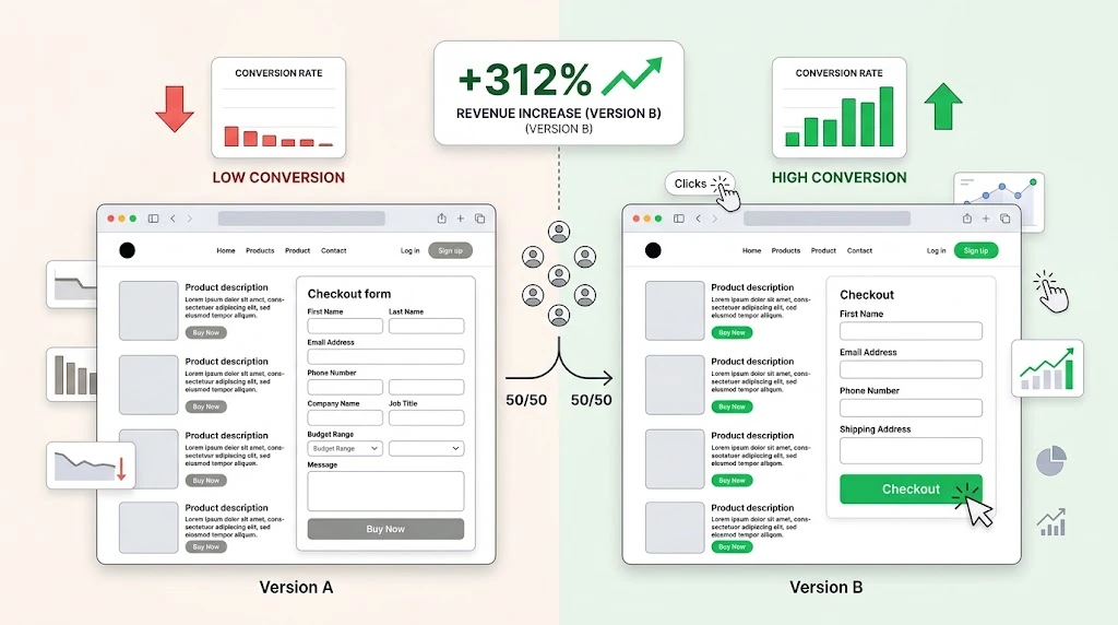
The approach is elegantly direct. You serve two versions of one page to distinct visitor segments at the same time. Version A is your current implementation, the control. Version B contains one isolated modification, the variant.
Your traffic splits randomly between them. You then measure which version produces more of your target action, whether that is a purchase, a lead form submission, or a content download.
Consider a bookstore that rearranges its display tables. One week, bestsellers face the entrance. The next week, staff picks take that spot. Customers do not know the layout is experimental. Their purchasing patterns reveal which arrangement drives higher sales. Online, visitors express preferences through their navigation choices. The winning arrangement becomes permanent. The losing arrangement still yields useful intelligence.
Why Small Tweaks Matter
Comprehensive overhauls are rarely necessary. In fact, the most understated changes often deliver the most dramatic outcomes. User behavior is fragile. A slight misalignment or delay can derail an otherwise motivated visitor.
People consume web content rapidly. They glance at headlines, they scan bullet points, they make decisions in milliseconds. Confusing or cluttered interfaces accelerate abandonment. Precise adjustments steer attention toward conversion goals. They minimize mental effort. They make action feel effortless.
Your refund policy might require scrolling to locate. Your mobile menu might bury the contact link behind three taps. Your trial signup might ask for credit card details before users experience the product.
A seasoned website designer understands that transparency outperforms persuasion. Removing doubt does more than adding urgency. When visitors encounter straightforward paths, they travel them willingly.
Do the math. Assume you attract twenty-five thousand visitors monthly. At a one-point-two percent conversion rate, you capture three hundred sales. Elevate that to one-point-eight percent by clarifying your guarantee and reducing checkout steps. You now have four hundred fifty sales. That is a fifty percent revenue increase from two modest tweaks. No new acquisition channels. No increased ad spend. Your existing visitors simply convert more efficiently.
How to Run Your First Test
The barrier to entry is far lower than commonly believed. Specialized software and data science backgrounds are unnecessary. Here is a proven sequence.
Step 1: Find a problem.
Resist testing without purpose. Analyze your metrics. Tools like Google Analytics, FullStory, or Hotjar reveal where visitors lose momentum. Pages with strong traffic but weak conversion rates are your primary targets. If users consistently stall at the comparison table, that is your starting point.
Step 2: Make a hypothesis.
A robust hypothesis reads like a forecast, not a fantasy. Avoid saying, “I want to try a different button.” Instead, write: “I predict that adding a progress bar to our multi-step form will increase completion rates by twenty percent because users will perceive the process as manageable.” This gives your test a defined mission.
Step 3: Build the variant.
Maintain strict discipline. Change one element per experiment. If you alter the headline, the image, and the form layout simultaneously, you cannot determine which change mattered. Configure your testing platform to modify exactly one component.
Step 4: Run the test.
Time is your most important variable. A five-day test might capture an unrepresentative period. Back-to-school season differs from mid-summer lulls. A web design company serving an e-commerce client may need to span multiple promotional cycles. Gather enough data that seasonal noise cannot explain your results.
Step 5: Pick the winner.
If the variant outperforms the control, deploy it universally. If the control prevails, retain it and formulate your next hypothesis. Consistent iteration compounds into significant gains.
Real-World Examples
Certain adjustments have proven their effectiveness across countless implementations.
First, the Call to Action copy.
The phrasing on your buttons influences behavior more than most assume. “Submit” feels bureaucratic. “Reserve My Seat” feels exclusive. One event platform changed “Register” to “Save My Spot” and saw sign-ups jump. The revised language suggested scarcity rather than obligation.
Second, form fields.
Every field you include is a filter that removes potential respondents. Asking for a company website, annual budget, and team size before delivering a simple whitepaper is excessive. Eliminate every question that does not serve a direct purpose. In most scenarios, an email address and first name suffice. Test abbreviated forms against your current version.
Third, images.
Generic corporate photography of models in pristine offices creates immediate distrust. Users have developed sophisticated blindness to these visuals. Replacing them with genuine imagery of your actual workspace, your real customers, or your product in authentic use builds rapport. Authenticity dissolves skepticism.
Fourth, pricing layouts.
Presenting every plan with identical visual treatment forces users to evaluate everything equally. Testing a layout that gives subtle prominence to one option, perhaps through size, color, or a “Recommended” marker, reduces decision paralysis. When one plan feels preselected, users gravitate toward it naturally. This presentation shift can spike selection rates dramatically.
Common Mistakes
A/B testing is conceptually simple but execution matters. These missteps waste effort.
Testing too many things at once.
Multivariate experiments require traffic volumes that most sites cannot generate. A solo website designer managing a local service business should keep tests ruthlessly focused. One change. One measurement. One advancement.
Stopping the test too early.
The impulse to declare victory is nearly irresistible. You monitor results after forty-eight hours. Version B shows a strong lead. You terminate the test and implement the change. This is premature. Early data is volatile. A single traffic source or promotional campaign can distort everything. Wait for your platform to confirm statistical significance, ideally at ninety-five percent confidence or higher.
Ignoring the losers.
An unsuccessful test triggers disappointment. Resist that reaction. You have successfully identified an approach that underperforms your current design. That knowledge is invaluable. It prevents you from investing in ineffective changes. Failed hypotheses refine your strategic compass.
Conclusion
Websites are dynamic instruments, not static monuments. The moment they launch, they begin aging. Treating them as complete guarantees irrelevance.
The transition from preference-based design to performance-based design is transformative. You do not need a massive budget or a lengthy rebuild to achieve meaningful results. You need a commitment to testing. Adjust a label. Reorder a section. Simplify a process.
The next time a design disagreement surfaces, you can offer an elegant resolution. Propose an experiment. Let your visitors render the judgment. Your revenue figures will validate that data-driven decisions consistently outperform opinion-driven ones.
Comments
No comments yet. Be the first to react!