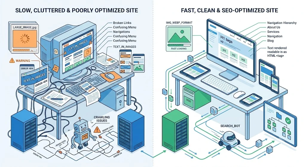
Search engine optimization lives in one mental box. Website aesthetics live in another. Ask most business owners to describe each discipline and you will hear two completely unrelated narratives. One involves data, algorithms, and content strategy. The other involves visual identity, brand expression, and creative taste. The reality is far more intertwined than popular thinking suggests.
Failing to recognize this intersection leads to projects that prioritize surface appeal at the expense of discoverability — or produce content that no one ever finds because the site holding it cannot be properly indexed. Here is where design decisions and search outcomes collide.
The Crawlability Problem
Google’s crawlers traverse the internet through links. They land on a page, read its content, extract every hyperlink, and follow those paths to additional pages. Repeat this process across millions of sites and you begin to appreciate why a clear, navigable structure matters so profoundly.
When a site’s internal linking resembles a maze with no consistent logic, crawlers hit dead ends. Pages buried three or four clicks from the homepage without any cross-references may never get indexed at all. Duplicate navigation patterns across different sections further confuse the crawling process, causing bots to waste time re-crawling the same content repeatedly.
Effective architecture starts with a deliberate hierarchy. Primary pages connect to secondary categories. Categories branch into individual articles and product pages. Every page links back to at least one higher-level parent. This layered approach creates multiple pathways that crawlers can follow without encountering barriers.
Someone who builds websites professionally understands these structural principles as foundational rather than optional. Before selecting a single color or choosing a typeface, they establish the skeleton that determines whether search engines can discover everything the site contains.
Why Desktop-Only Thinking Fails
Google publicly shifted its indexing approach to prioritize mobile rendering. The search engine now crawls your site as a smartphone browser would see it. If your desktop experience is polished but your mobile layout suffers from broken columns, unreadable text, or inaccessible navigation, that mobile version becomes the basis for ranking decisions.
Responsive construction eliminates the need for separate mobile and desktop versions entirely. A single codebase detects the visitor’s screen dimensions and adapts fluidly. Elements rearrange themselves. Spacing adjusts proportionally. Touch targets scale to finger-friendly sizes without explicit instruction.
The consequences of neglecting this are measurable. Pages that frustrate mobile visitors generate high bounce rates, short session durations, and frequent returns to the search results page. Search engines interpret these patterns as dissatisfaction signals and reduce the page’s visibility accordingly.
Professionals who build for modern audiences test across a range of real devices during development. They verify that every critical function works equally well on a four-inch screen and a twenty-seven-inch monitor. Consistency across contexts is not a luxury — it is the baseline requirement for competitive ranking.
The Hidden Weight of Visual Choices
Performance discussions in digital marketing rarely examine how aesthetic preferences affect load times. Yet every design decision carries a performance implication. A full-bleed hero photograph at three thousand pixels wide weighs significantly more than a thoughtfully cropped version. A library of eight custom fonts slows rendering dramatically compared to two carefully selected families.
When pages load slowly, search engines respond negatively. Studies consistently demonstrate that each additional second of load time increases bounce probability substantially. For e-commerce sites, those delays translate directly into lost revenue. For content sites, they translate into lost readership.
Balancing visual richness with technical efficiency requires deliberate restraint. Compressing images before upload, selecting efficient font formats, deferring non-essential scripts, and limiting decorative animations to high-impact moments all contribute to faster rendering without sacrificing aesthetic quality.
A web designer with genuine technical depth treats page speed as a design constraint from the earliest planning stages. Rather than optimizing after the visual work is complete, they measure performance continuously throughout the creative process and make adjustments before problems compound.
Behavioral Signals in the Algorithm
Google measures how users interact with your pages after arriving from search results. Time on page, scroll depth, click-through to additional pages, and whether someone immediately returns to the results list all feed into ranking calculations. These behavioral metrics serve as proxies for content quality and relevance.
Design profoundly shapes these interactions. A page with inconsistent spacing between sections creates a disjointed reading experience. Navigation menus that use jargon instead of plain language leave visitors uncertain about where to click next. Pages without clear visual hierarchy force users to scan aimlessly rather than absorb information efficiently.
Structuring content with generous whitespace, readable line lengths, and prominent section breaks keeps visitors engaged. Placing related content links at natural transition points encourages deeper exploration. Consistent layout patterns across pages build familiarity that reduces cognitive friction.
Agencies that build digital experiences pay close attention to these behavioral indicators. They analyze how real visitors navigate, identify drop-off points, and refine layout patterns based on observed usage rather than assumptions.
When Text Disappears Into Graphics
A surprisingly common problem involves rendering essential page content as part of image files rather than as coded HTML text. A designer creates a visually appealing banner that incorporates the company’s core messaging. The resulting graphic looks polished. Search engines, however, perceive only the image file name — they cannot extract individual words from pixels.
This distinction matters enormously for relevance. Your homepage headline, when coded as HTML, tells search engines exactly what your page addresses. The same headline, baked into a JPEG, contributes nothing to keyword relevance or topical understanding.
The fix is straightforward. Text should remain as text. CSS provides extensive styling capabilities — variable font weights, creative letter spacing, background gradients applied to text containers, and responsive sizing that adapts to any viewport. The visual result can be indistinguishable from an image while remaining fully machine-readable.
Every word trapped inside a graphic file represents an opportunity lost to communicate your page’s relevance to the algorithms determining your ranking position.
Preventing Frustrating Layout Shifts
Core Web Vitals, Google’s standardized performance metrics, include a measurement called Cumulative Layout Shift. It tracks how much visible content jumps during the loading process. When an image renders above an existing paragraph and pushes that text downward, the displacement registers as a layout shift. Repeated occurrences degrade the score.
Visitors experience these shifts as jarring interruptions. Attempting to click a button only to have it move seconds before contact creates genuine frustration. Reading a paragraph that suddenly jumps down the screen because a late-loading element displaced it disrupts concentration and erodes trust.
Reserving explicit dimensions for every image, video, and embedded element before they load prevents this instability. Font loading strategies that minimize text reflow contribute additional stability. Planning for asynchronous content like advertisements with predefined placeholder slots eliminates surprise displacements.
Addressing these technical requirements demands someone fluent in both visual and engineering disciplines. A web designer who understands how rendering order affects visual stability can prevent problems that purely aesthetic thinking would never anticipate.
Assembling the Right Expertise
Brilliant written content published on a structurally flawed foundation will consistently underperform. The intersection of creative output and technical infrastructure determines whether any individual page reaches its intended audience. Too many projects treat this junction as someone else’s problem.
The professional you choose to build your site shapes outcomes in ways that persist long after launch. An experienced web design agency evaluates projects across every dimension simultaneously — crawlability, responsiveness, speed, usability, and visual coherence. They understand that optimizing any single dimension while neglecting the others produces diminished returns.
The most effective partnerships form when project owners engage technical expertise early enough to influence architectural decisions. Waiting until visual design is complete to address structural concerns frequently requires expensive rework. Building with search visibility as a concurrent priority from the outset avoids these costly corrections.
The Core Takeaway
Treating visual presentation and search optimization as unrelated disciplines produces websites that function well in isolation but fail as integrated systems. Structure determines how thoroughly crawlers index your content. Speed influences whether visitors stay long enough to absorb it. Usability shapes every interaction between your audience and your brand message.
Achieving meaningful search visibility requires more than keyword research and content calendars. It demands a technically sound architecture built with deliberate precision from the ground up. Engage a professional who understands how creative decisions reverberate through search algorithms. If your project involves multiple disciplines, a web design agency capable of integrating design, engineering, and optimization under a single strategy will deliver compounding benefits over time.
Build for both audiences simultaneously — the humans navigating your pages and the machines evaluating them.
Comments
No comments yet. Be the first to react!